Behind the logos of famous brands Supreme, Thrasher and The Life of Pablo
Nowadays, it is so common to find people on the street standing in line to buy an item for several hours or even days, and no one is wondering about it. However, it is unreasonable for those people to spend so much effort just to buy a plain white T-shirt, or a very simple gray hoodie with only the logo on the shirt but There is absolutely no information about who designed it. In the streetwear world, logos are king – and we need to know about the names behind them.
Thank you for reading this post, don't forget to subscribe!Page The Coveteur has compiled information about street-style brands, giving us a better understanding of the details, the logo designers of Supreme, Thrasher and Kanye’s The Life of Pablo. Here, let’s learn about them with Eachshoes.
Thrasher (1981)

Font: Banco
Year of use: 1951, by French typesetting expert Roger Excoffon.
Introduce: This Banco typeface does not look luxurious and is quite sketchy compared to its contemporary counterparts, but it is not so popular – on the contrary, this typeface is used a lot on signs and windows. of the stores, hair salons and bookstores in Europe at that time. This typeface has persisted over time but no one thought it could be chosen to use for a brand name. Not until Bob Marley used this font for the album cover Natty Dread In 1974, Banco was brought back to people and exploded like never before.
Undeniably the great merits from skateboard magazine Thrasher using this font on their logo t-shirts, which made it extremely popular in 1981. Today quite a few stars are seen wearing the brand’s shirts. Although there are a few scandals such as Thrasher magazine with Rihanna and Justin Bieber, but did not bring any trouble for Thrasher. On the contrary, this brand name is also hotter.
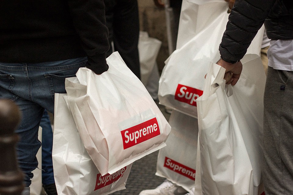
Supreme (1994)

Font: Futura Bold Italic
Year of use: 1927, designed by Paul Renner. More outer box details by artist Barbara Kruger in 1979. Refreshed by Supreme in 1994.
Introduce: Although there is still a bit of confusion about the accuracy of the story surrounding this, Supreme has essentially admitted that the font Kruger uses is similar to that of Renner. This is easy to see because the typeface is no different in a copyright infringement lawsuit in 2013. But Renner never sued Supreme, it was the brand that accused Leah McSweeney (of the brand. Married to the Mob) about this person releasing a line of parody and sarcasm of the opponent with the name “Supreme Bitch”.
The Life of Pablo (2016)

Font: Gothic
Year of use: Gothic, also known as Blackletter, was widely used in western Europe from 1150 to around the 17th century. However, Cali Thornhill DeWitt, an author / designer / DJ / photographer raised the bar. level this typeface, making them special and relevant to the lineup The Life of Pablo Kanye’s debuted earlier this year.
Introduce: Unlike Thrasher and Supreme, there doesn’t seem to be any scandals regarding this logo or label as of now. This seems a bit strange because for everyone, because Kanye West – the designer of this series is always surrounded by the market. The designer of the logo – talented artist Cali Thornhill DeWitt also did not charge a single design fee, although the product line has been in operation with this logo this year. What a wonderful man!
Source: highsnobiety
Comment
Source: Behind the logos of famous brands Supreme, Thrasher and The Life of Pablo
– Eachshoes.com